Your cover spread—front and back—is one of the most important ways to entice readers to pick up your book. Your author photo is an important piece in the total package. You’ll also be using it on social media, press releases, and in other features. It’s worth taking the time to get it right.
Readers need to see who you are.
– Leave your cute kids, pets, and spouse out of it. This is about the book, and the author.
(I made a large exception: my boat). I knew I wanted my setting to be outdoors by boats and the water. Even if it didn’t show, because typically the best shots are tight in on the writer, the feeling of the place would be there. I got permission in advance from fellow boaters to crawl around on a bunch of cool yachts. As it turned out, my own 32-foot DownEast Chip Ahoy worked out just fine.
– Hire a professional. No selfies.
No selfies. No! Doesn’t matter how good your phone camera is. Forget anything that’s blurry, cropped from a group shot, or taken at a distance. This is your book. You worked so hard on it. Give it your all in this part of the process. You need a sharp, well-composed image that tells readers something about who you are. Get over yourself if you’re camera shy, or feel like you’re being egotistical. This is not selfish. It’s smart marketing that helps you connect with your audience.
– Know your genre and your intent.
The first photographer who graciously offered to work with me (in exchange for writing his bio) didn’t work out because the days he was available the natural light wasn’t great outside and the wind was howling.
Don’t worry about that, he said. I’ll just shoot you at your house and Photoshop in a background, then throw on some amazing filters so you don’t look so old and wrinkly.
Well, those weren’t his exact words. But it’s true, he wanted to glamify me.
The older I get, the more I want to look like myself. And my novel, More Than You Think You Know, is very much about being OK with looking how you look. Airbrushing doesn’t fit the genre.
So I asked another photographer whose work I admire, and who shares my sensibilities about sense of place, if she might have time to do it, or could recommend someone. We had to wait a few months to find a date that worked. That will probably be the case for you too, because good photographers are usually booked all the time. Make a plan in advance.
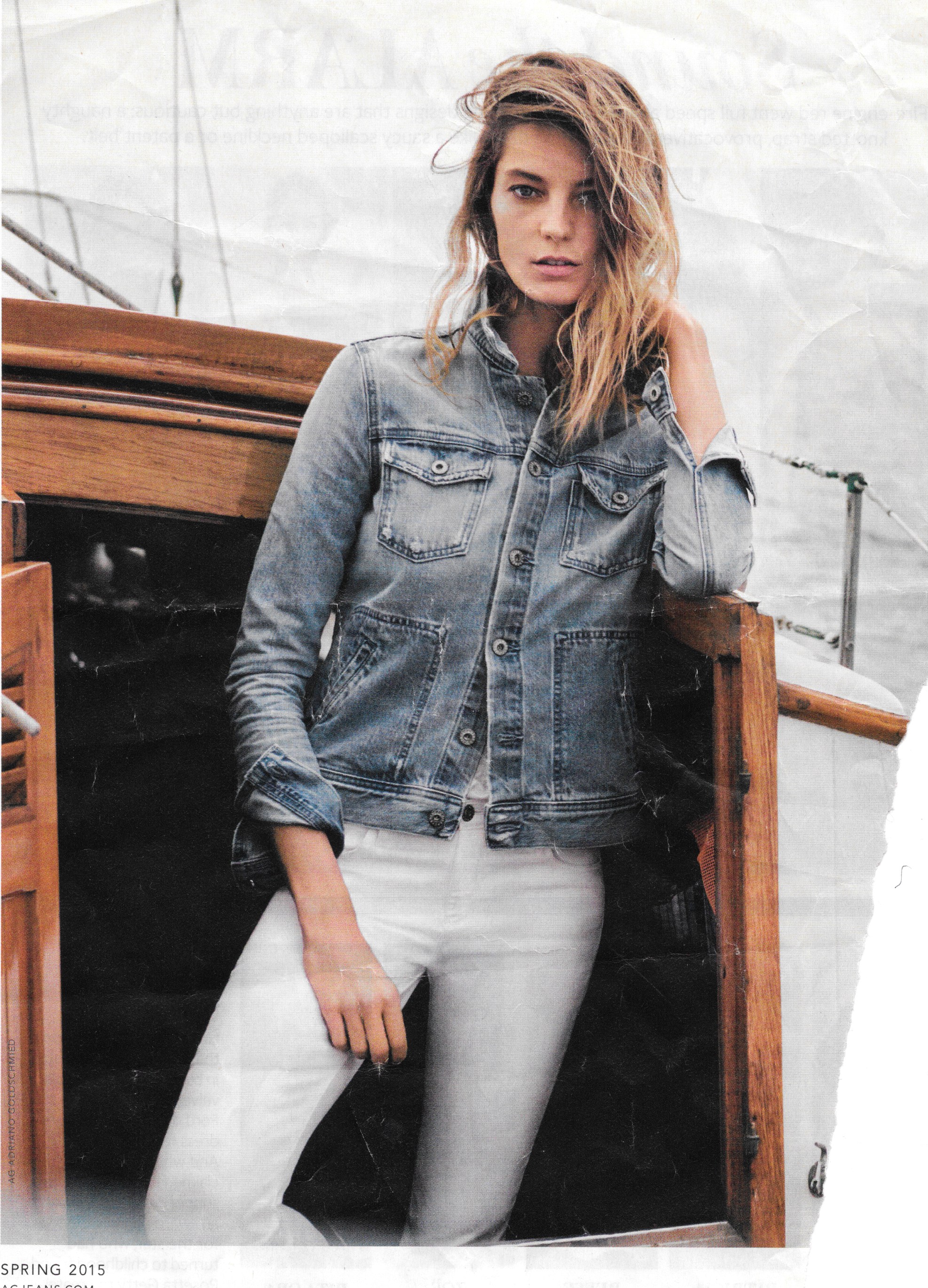
One of my inspiration photos from an AGjeans.com ad.
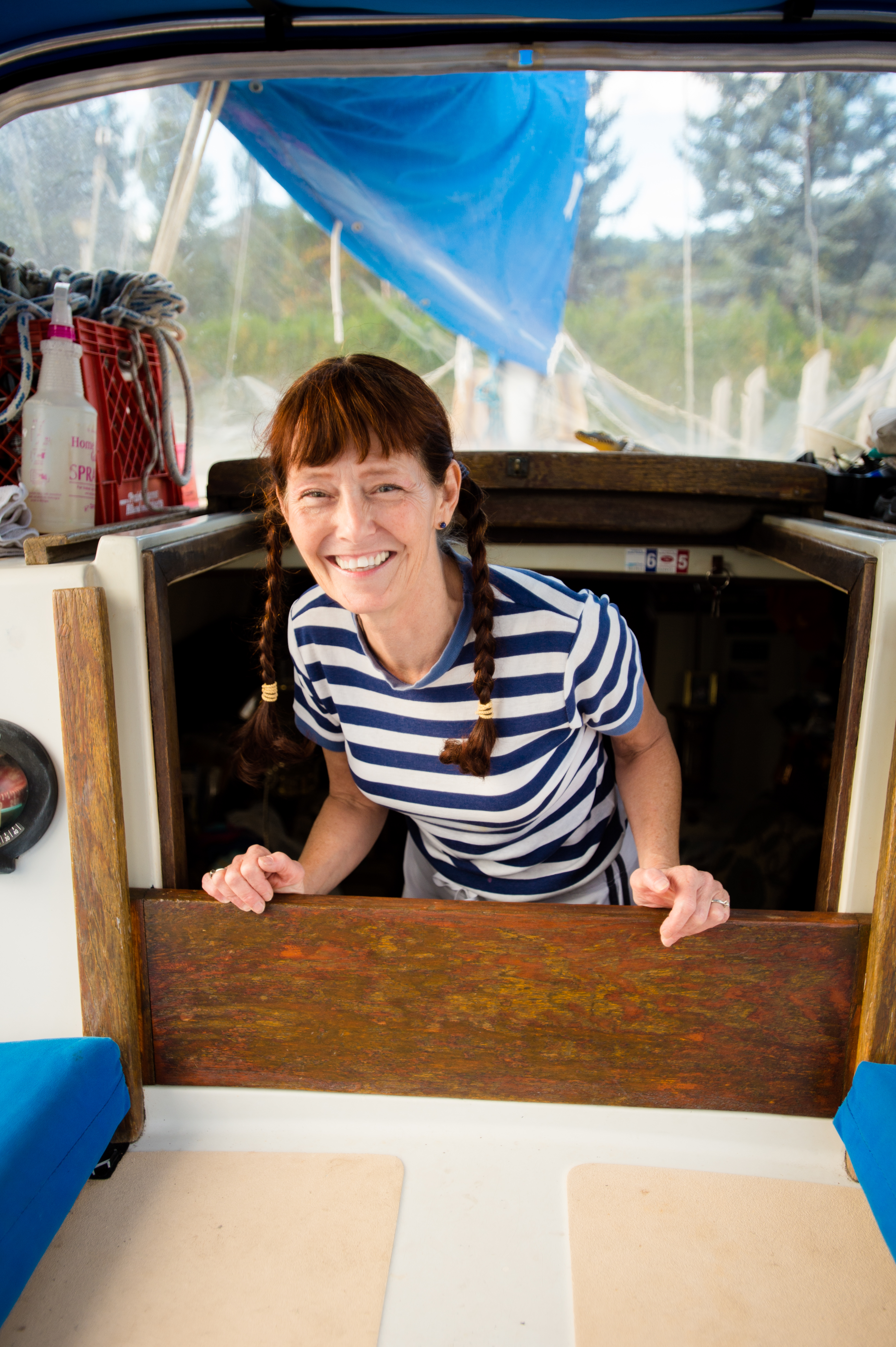
How that translates in Cyndiland, lol.
– Find shots that inspire you. Check out the kind of photos big-name authors favor.
I looked at my collection of John Irving and Anne Tyler novels.


Patricia Cornwell also gives good face. Their photos are attractive, but also look like you caught them in the middle of work (not gussied up) and they’re not at all worried about how they look. Google other author photos to see what might work for you. And if you’ve got time in an airport, that’s also a great place to see how the hot sellers present themselves and their work.
– Jot down a shot list.
Plan for a change of clothes and scenery. But don’t switch it up just for the sake of change. Not your senior photo, remember?
Take a cue from nature. Where can the photographer capture you in your natural habitat, and capture the essence of your book, and what will you be wearing?
If you’re writing a non-fiction business book, perhaps you want a buttoned-down-but-accessible look. I wanted a nautical-female feel for my novel, because it’s about three bad-ass women piloting a 44-foot yacht down the Heartland Rivers from the Great Lakes to the Gulf of Mexico.
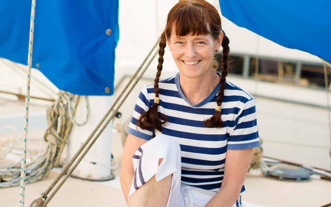
My basic shot list: go to the local marina where my boat is docked and find the best light, (always near sunrise, and again near sunset). Potential locales—by the bridge, on power boats, on sailboats. Maybe sitting on the grass, or on a dock. As it turned out, the evening conditions were perfect right on the boat.
My wardrobe:
– White blouse, blue jeans, boots, blazer—hair down
– Sailing foulie gear—aqua bib overalls and a high-collared aqua-and-yellow waterproof jacket.
– My old navy-and-white striped t-shirt with navy and white capri sweats, NY Laundry sweatshirt, barefoot—braids
We didn’t need the other clothes. My old sailing clothes and bare feet worked great. Still, I was glad to have options.
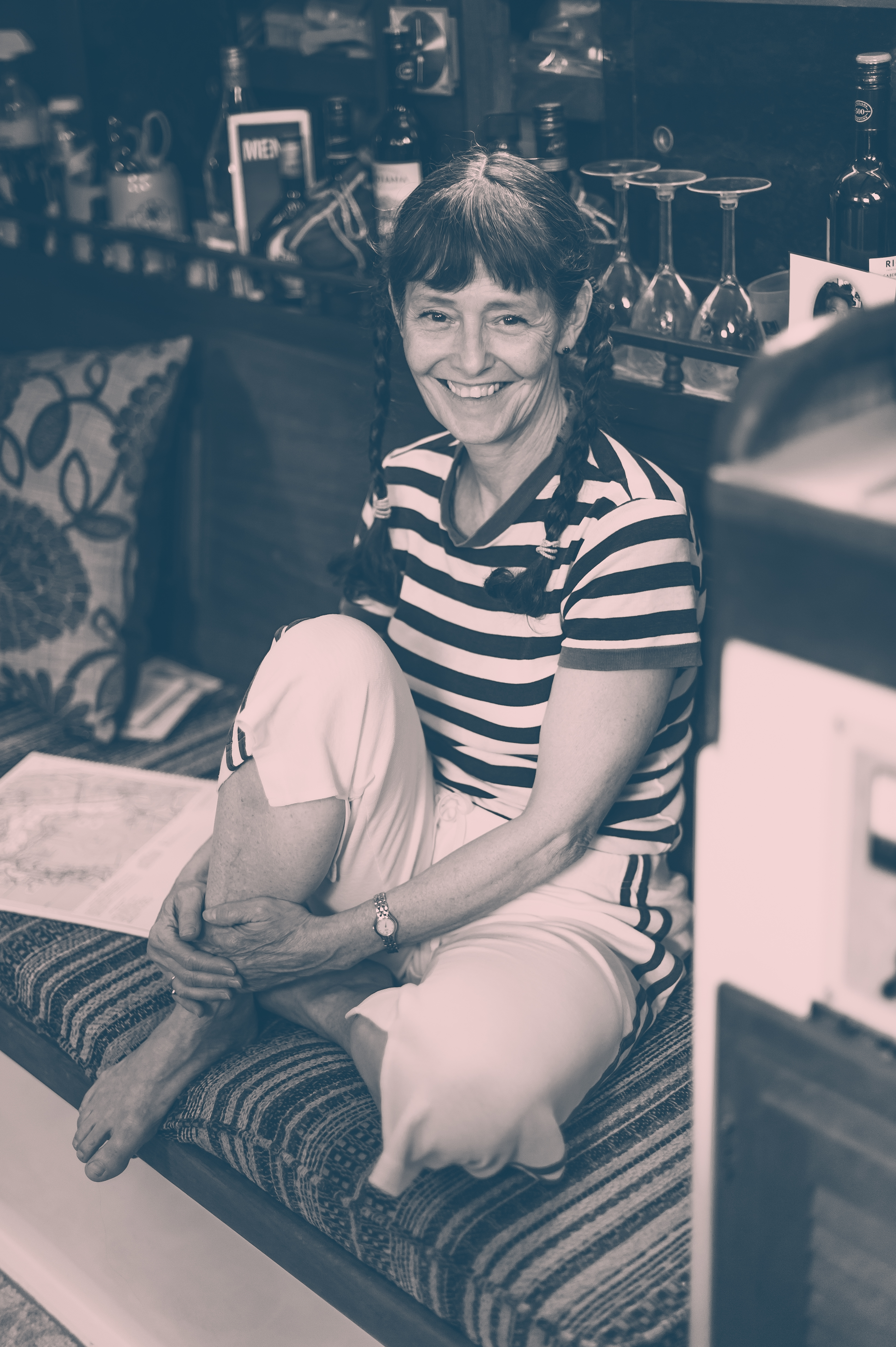
Getting comfortable down below in Chip Ahoy’s cabin. A good photographer will factor in time to relax. You should, too. Below, pensive can work, if the emotion is genuine. But even if your book is dead serious, you can still smile!
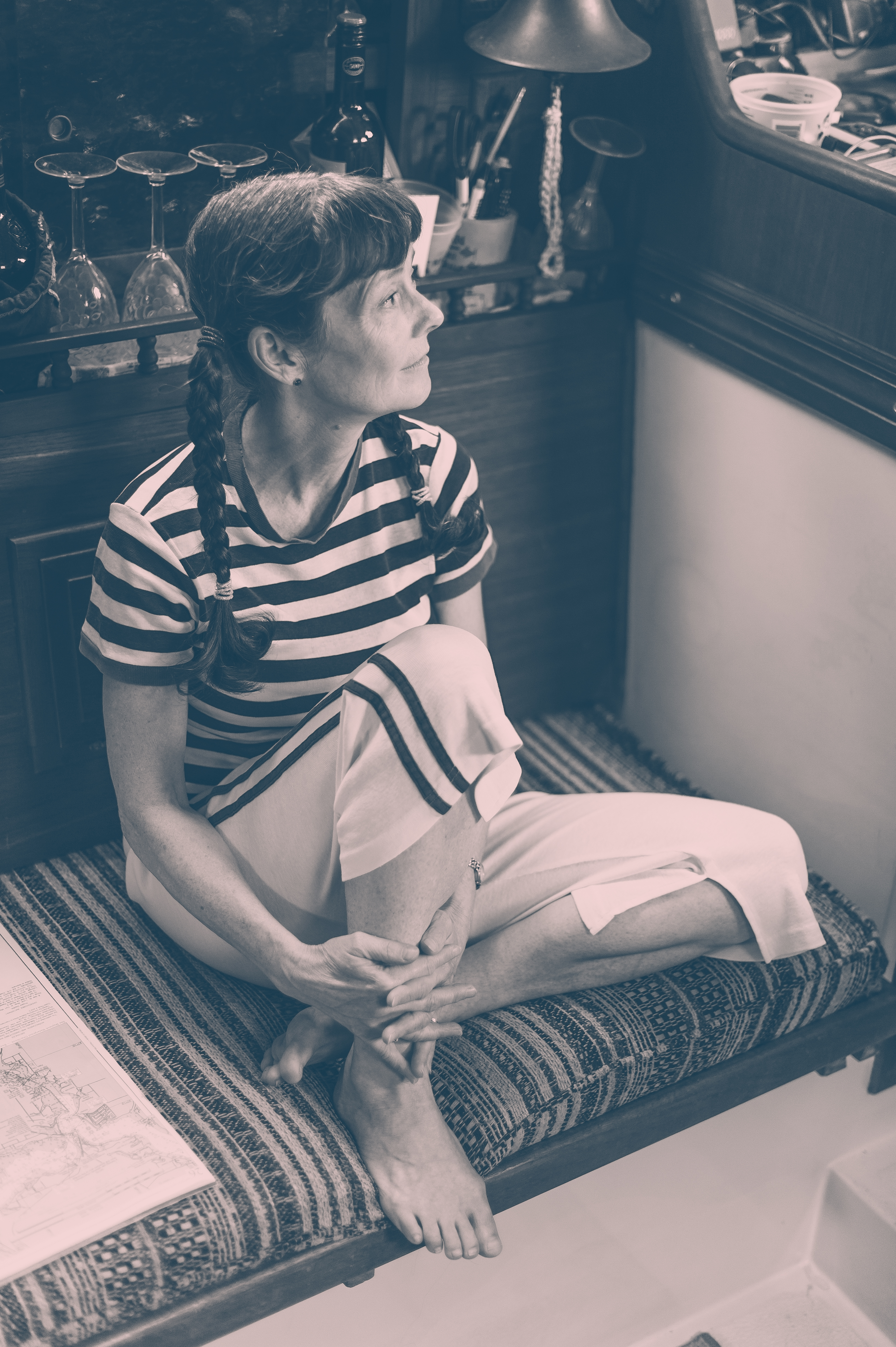
Parting shots:
- So which shot did I end up with on the More Than You Think You Know back cover? Find out during my cover reveal at the end of March (Beating Windward Press is asking readers to weigh in on the design, so exciting—check out BWP Facebook and mine for details as the Live event gets closer.)
- Sarah Bird, who took my portraits, has a gift for putting humans at ease and capturing their images in those moments. Follow her on Instagram at @sarah_bird
- Jane Friedman has great advice in general for your back cover, including copy and photo.
- Laugh and learn from the my-head-is-so-full-of-thoughts-I-have-to-prop-it-up pose and other author bio photo gaffes via Huffington Post and flavorwire.com.
- Why author photos matter (for good or bad)—a think piece on self-deprecating, cute, or serious poses and what they mean.
How did your bio photos turn out, fellow author? Share your dos-and-don’ts here, or Tweet images .@cyndiperkins I can see them! Share on Insta at #amwriting #authorphotos #bookjacketcover—I’ll be searching for yours!

Photography right on!! Important!! Absolutely looking forward to your new book! Trucknphil. SEMPER FI
I am so grateful for your support—and your daily uplifting photos on Instagram. Thanks for always being fun and positive—and sharing your views.